420+
Reusable components
Built as modular structures that adapt across sites.
Monolith was created around a simple principle: clarity comes from structure. By separating layout, styling, and behavior into defined layers, we help teams build digital foundations.
Built as modular structures that adapt across sites.
Design tokens and class logic keep every page aligned as it scales.


Professionally designed starting points built on the Monolith system. Each kit showcases structure, scalability, and consistent design logic across pages.
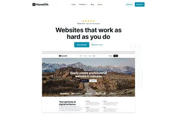
A clean, conversion focused layout for digital agencies and service based teams. Structured sections, clear hierarchy, and flexible blocks make it easy to present services and case studies.
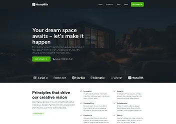
Minimal and spatial by design. Built for studios and creators who value strong typography, visual rhythm, and refined layouts that highlight projects without distraction.

Designed for events and launches. Structured schedules, speaker profiles, and call to action sections help you communicate information clearly while keeping the experience engaging.

Bold, high trust layouts for tech driven brands. Strong contrast, modular feature grids, and data focused sections make complex services easier to understand.
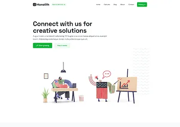
Structured and professional. Designed for financial services that require clarity, authority, and credibility across landing pages, service breakdowns, and trust signals.
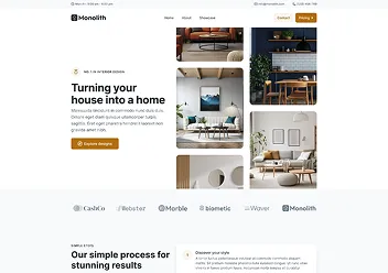
Elegant and image forward. Balanced layouts with strong visual flow that allow projects, galleries, and storytelling to shine while staying structurally consistent.
Tellus justo in lectus faucibus. At donec feugiat imperdiet dictum augue amet facilisis ut. Elementum at platea tincidunt quam id sed est erat nisl.
Monolith completely changed how we approach website structure. Instead of rebuilding layouts again and again, we now rely on reusable components and centralized styling. It gave our team a system that makes collaboration faster.

What impressed me most is how clearly everything is separated. Layout, styling, and logic do not fight each other anymore. The variable and class system keeps our projects consistent even as they grow and evolve over time.

As a designer, I finally feel in control of the whole system. Typography, spacing, and components follow one unified logic, which means fewer visual inconsistencies and much smoother handoffs between design and development.

We help teams build scalable systems, streamline workflows, and create consistent digital experiences across every project.

A growing library of modular components designed to accelerate development.
Strict design standards ensure reliable layouts, predictable behavior, and cohesive experiences.
Prebuilt page structures that allow teams to launch complex layouts quickly without redesigning.
Centralized style tokens control colors, spacing, and typography for fast global design changes.